As an Amazon Associate I earn from qualifying purchases.
Are you using Python for finance? Let’s see how you can plot a candlestick chart in Python using financial data. For this tutorial, I will be getting my financial data from MT5. If you are unsure of how to do this, I recommend checking out this article on Getting Data from MT5 to Python. For this tutorial, you will be using Plotly. Plotly is a browser-based graphing Python library used for the visualization of data. You can read more about Plotly here.
Getting Started – Installing required libraries
To get Plotly running on Python, you will need to get the library which can be downloaded using pip install with the following command:
pip install plotlyYou will also need to install the Pandas library which is a fast, powerful, flexible, and easy to use open-source data analysis and manipulation tool, built on top of the Python programming language. (If you are following the Algotrader series, you won’t need to do this step)
pip install pandasOnce you have installed Plotly and pandas, import both libraries into Python:
import plotly.graph_objects as go
import pandas as pd
Now, you should be able to access the Plotly and Pandas library within Python!
Getting the chart data
For this tutorial, I have pulled data for USDCAD between 1-1-2021 and 2-12-2021. This data is available to download with the link below:
Place USDCAD.csv in the same directory as your Python script.
Once this has been downloaded, let’s create a method named print_chart_data with no method arguments:
def print_chart_data():And inside this method, let’s start by importing the csv file using pandas:
data = pd.read_csv("USDCAD.csv")If you print out this data frame it will look like the following:
                     time     open     high      low    close  tick_volume  spread  real_volume
0     2020-12-31 22:30:00  1.36696  1.36729  1.36645  1.36652          365      12            0
1     2020-12-31 22:45:00  1.36653  1.36745  1.36615  1.36745          655      13            0
2     2020-12-31 23:00:00  1.36745  1.36745  1.36745  1.36745            1      19            0
3     2021-01-04 00:00:00  1.36452  1.36518  1.36443  1.36507          119      60            0
4     2021-01-04 00:15:00  1.36492  1.36632  1.36484  1.36546          146      31            0
...                   ...      ...      ...      ...      ...          ...     ...          ...
2878  2021-02-12 22:45:00  1.38499  1.38523  1.38490  1.38513          622       0            0
2879  2021-02-12 23:00:00  1.38514  1.38552  1.38496  1.38551          261       0            0
2880  2021-02-12 23:15:00  1.38551  1.38559  1.38510  1.38516          404       0            0
2881  2021-02-12 23:30:00  1.38516  1.38546  1.38505  1.38531          334       0            0
2882  2021-02-12 23:45:00  1.38534  1.38546  1.38507  1.38533          455       0            0
Plotting the chart
To plot the candlestick chart you will need the time, open, high, low and close columns. Create a go.Candlestick object, assign these fields and then, assign it to a variable named chart_data:
def print_data_chart():
    data = pd.read_csv("USDCAD.csv")
    chart_data = go.Candlestick(x=data['time'], open=data['open'], high=data['high'], low=data['low'], close=data['coose'])
Now, you need to create a go.Figure to display the data. Create this object passing in chart_data and assigning it to a variable named fig:
def print_data_chart():
    data = pd.read_csv("USDCAD.csv")
    chart_data = go.Candlestick(x=data['time'], open=data['open'], high=data['high'], low=data['low'], close=data['close'])
    fig = go.Figure(data=[chart_data])
Finally, to print your graph to the browser, add fig.show()
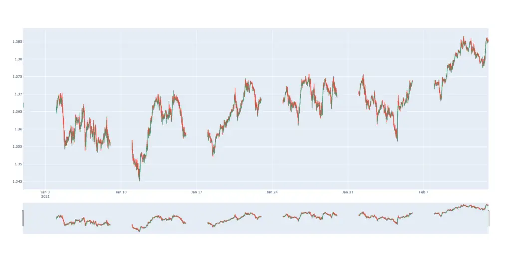
You should now see the following graph on your browser. If you are wondering why there are gaps in the data, it is because USDCAD does not get traded over the weekend.


That’s all for how to Plot a candlestick chart for stocks, forex, or crypto in Python! Check back on Friday to see how you can create an equity curve graph with Python! As always, if you have any questions or comments please feel free to post them below. Additionally, if you run into any issues please let me know.

