As an Amazon Associate I earn from qualifying purchases.
In this tutorial, I will show you how to plot a candlestick chart with moving averages with Plotly. Before you get started with the code, you will need to install some libraries.
Getting started
Required libraries
TA-Lib – To calculate moving averages
Plotly – Library used to generate the chart
Pandas – To store the chart data
Install dependencies
To install TA-Lib for Python, you will first need to install the TA-Lib dependency.
Windows: http://prdownloads.sourceforge.net/ta-lib/ta-lib-0.4.0-msvc.zip
Linux: http://prdownloads.sourceforge.net/ta-lib/ta-lib-0.4.0-src.tar.gz
MacOS: ‘brew install ta-lib’
Install libraries
After you have installed the dependency for TA-lib, go ahead run the following commands to install the Python libraries for TA-Lib, Plotly and Pandas:
pip install TA-Lib
pip install plotly
pip install pandas
Import the libraries
Start by importing the libraries to Python:
import plotly.graph_objects as go
import pandas as pd
import talib as ta
Getting the chart data
Candlestick data
For this tutorial, I have pulled data for USDCAD between 1-1-2021 and 2-12-2021. This data is available to download with the link below:
Place USDCAD.csv in the same directory as your Python script.
Once this has been downloaded, let’s create a method named print_chart_data with no method arguments:
def print_chart_data():And inside this method, let’s start by importing the csv file using pandas:
data = pd.read_csv("USDCAD.csv")If you print out this data frame it will look like the following:
                     time     open     high      low    close  tick_volume  spread  real_volume
0     2020-12-31 22:30:00  1.36696  1.36729  1.36645  1.36652          365      12            0
1     2020-12-31 22:45:00  1.36653  1.36745  1.36615  1.36745          655      13            0
2     2020-12-31 23:00:00  1.36745  1.36745  1.36745  1.36745            1      19            0
3     2021-01-04 00:00:00  1.36452  1.36518  1.36443  1.36507          119      60            0
4     2021-01-04 00:15:00  1.36492  1.36632  1.36484  1.36546          146      31            0
...                   ...      ...      ...      ...      ...          ...     ...          ...
2878  2021-02-12 22:45:00  1.38499  1.38523  1.38490  1.38513          622       0            0
2879  2021-02-12 23:00:00  1.38514  1.38552  1.38496  1.38551          261       0            0
2880  2021-02-12 23:15:00  1.38551  1.38559  1.38510  1.38516          404       0            0
2881  2021-02-12 23:30:00  1.38516  1.38546  1.38505  1.38531          334       0            0
2882  2021-02-12 23:45:00  1.38534  1.38546  1.38507  1.38533          455       0            0
Calculating moving average
For this example, I will be calculating the 120EMA. Start by calling the EMA function in the TA-Lib Library.
The EMA function takes 2 parameters, close price and time period. Use the close price from the data data frame and pass 120 as the period since we want to calculate the 120EMA. You will also need to assign this to a new column named 120EMA in the data data frame:
data['120EMA'] = ta.EMA(data['close'], 120)Note: The full set of functions available in TA-Lib can be found here https://ta-lib.org/function.html
Plotting the chart
To plot the candlestick chart, you will need the time, open, high, low and close columns. Create a go.Candlestick object, assign these fields and then assign it to a variable named chart_data:
def print_data_chart():
    data = pd.read_csv("USDCAD.csv")
    data['120EMA'] = ta.EMA(data['close'], 120)
    chart_data = go.Candlestick(x=data['time'], open=data['open'], high=data['high'], low=data['low'], close=data['close'])
After this, create a go.Figure to display the data. Create this object passing in chart_data and assigning it to a variable named fig:
def print_data_chart():
    data = pd.read_csv("USDCAD.csv")
    data['120EMA'] = ta.EMA(data['close'], 120)
    chart_data = go.Candlestick(x=data['time'], open=data['open'], high=data['high'], low=data['low'], close=data['close'])
    fig = go.Figure(data=[chart_data])
So far, we have created a candlestick chart but you still need to add the 120EMA plot to the chart.
Create a go.Scatter object, setting x as data['time'] and y as data['120EMA']. You will also need to specify the mode. In this case, the mode will be lines since we want to plot a line chart:
def print_data_chart():
    data = pd.read_csv("USDCAD.csv")
    data['120EMA'] = ta.EMA(data['close'], 120)
    chart_data = go.Candlestick(x=data['time'], open=data['open'], high=data['high'], low=data['low'], close=data['close'])
    fig = go.Figure(data=[chart_data])
    ema_trace = go.Scatter(x=data['time'], y=data['120EMA'], mode='lines', name='120EMA')
To add the new scatter plot, call fig.add_trace and pass in the variable ema_trace:
def print_data_chart():
    data = pd.read_csv("USDCAD.csv")
    data['120EMA'] = ta.EMA(data['close'], 120)
    chart_data = go.Candlestick(x=data['time'], open=data['open'], high=data['high'], low=data['low'], close=data['close'])
    fig = go.Figure(data=[chart_data])
    ema_trace = go.Scatter(x=data['time'], y=data['120EMA'], mode='lines', name='120EMA')
    fig.add_trace(ema_trace)
Finally, use fig.show() to display the chart:
def print_data_chart():
    data = pd.read_csv("USDCAD.csv")
    data['120EMA'] = ta.EMA(data['close'], 120)
    chart_data = go.Candlestick(x=data['time'], open=data['open'], high=data['high'], low=data['low'], close=data['close'])
    fig = go.Figure(data=[chart_data])
    ema_trace = go.Scatter(x=data['time'], y=data['120EMA'], mode='lines', name='120EMA')
    fig.add_trace(ema_trace)
    fig.show()
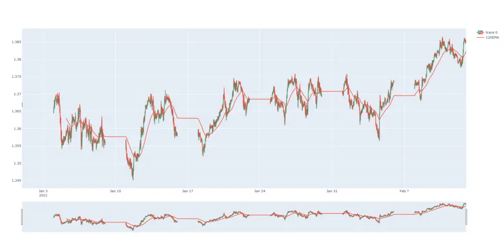
When you call the print_data_chart() method, you should see the candlestick plot and the 120EMA trace on the same plot:


Interested in creating your own algo trading bot? Check out my free series on algo trading here: https://www.conorjohanlon.com/category/algotrader/
That’s all for how to Plot a candlestick chart with moving averages with Plotly! As always, if you have any questions or comments please feel free to post them below. Additionally, if you run into any issues please let me know.


there are slight discrepancies in ema calculated by this and chart on trading view,
I have calculate ema20 and made changes accordingly in the function
eg.
ethaud – binance
23 March 10:45 calculated ema – 2210.497 trading view chart ema – 2210.50
23 March 10:50 calculated ema – 2211.472 trading view chart ema – 2211.01
def print_data_chart():
data = pd.read_csv(“ethaud.csv”)
data[’20EMA’] = ta.EMA(data[‘close’], 20)
chart_data = go.Candlestick(x=data[‘timestamp’], open=data[‘open’], high=data[‘high’], low=data[‘low’], close=data[‘close’])
fig = go.Figure(data=[chart_data])
ema_trace = go.Scatter(x=data[‘timestamp’], y=data[’20EMA’], mode=’lines’, name=’20EMA’)
fig.add_trace(ema_trace)
fig.show()
what needs to be changed?
Interesting. Are both data sources binance?